— PROJECT NAME
Artemism Brand Identity
— ROLE
Art Direction
Graphic Design
Branding
Copywriting
Conceptualization
— DATE
02/03/2022
Introducing an ethical cosmetic line that embodies women's self-empowerment through identity design poses an exciting challenge. In this portfolio work, I immerse myself in the creative process of positioning and crafting a visual identity for a cosmetics brand that is rooted in ethical values and dedicated to uplifting women. Through thoughtful identity design, I aim to capture the essence of this self-made brand and convey a message of empowerment, while maintaining a visually compelling and cohesive aesthetic.
Explore the visual story I have crafted and witness how design can be a catalyst for inspiring change and promoting inner strength among women.
CREATIVE
PROCESS
Insight
Women are often raised to live up to unrealistic beauty standards put upon them by society. They have the pressure to look a certain way for society to at least acknowledge their “beauty” even when they have tried to mold themselves to please others. The insane depictions of how they should look could easily cause body dysmorphia and low confidence especially for someone that is never taught to love who they are from the beginning.
Dozens of skincare “must-have” can leave you feeling like you’re not doing enough despite that most of these products on the market are gimmicky, with sub-par ingredients that often do more harm than good to your skin.
Approach
I want to introduce an approach to women’s skin health in which minimal is enough, their skin needs are met beyond the face, and the experience of women’s skincare ritual is something they crave and enjoy, not dread. I aim to create a line of beauty products that enhance beyond women’s appearance which starts with embracing their inner core of individualism and practicing self-confidence and self-love.
Challenge
Rigid plastics that are typically utilized in the skincare industry. Rigid is more difficult to recycle and takes longer to decompose. To be the brand to empower others is to lead the way. Our impact is not simply the movement of money toward a worthy cause. It's also taking responsibility for the environment. As an eco-conscious brand reaching toward socially conscious women, we are serious about creating sustainable solutions for a somewhat modern environmental issue: plastic waste.
Solution
This inspired me to focus on using minimal ingredients from the nature to maximize the results that every empowering woman deserves while also circumventing environmental issue by offering products that do an exceptional job without plastic packaging as much as possible. From the communication messaging to the logo representation to the brand assets, all shall be consistently designed to symbolize the brand’s deep-rooted connection to nature.
Ideation
Why Artemism? Artemis + Artemisia
Artemism is born with the aim of redefining the relationship we have with our appearance, our mind and nature.
Artemis, the Greek Goddess of female emancipation, symbolizes the untamed and sacred feminine energy within everyone. She sought freedom of choice and a life without marriage, embracing her independence and running through the woods with her hunting dogs. Artemis represents strength, nurturance, and unwavering protection. She encourages us to heed our inner voice, love ourselves, and be grounded in our essence. Like Artemis, embracing self-love means directing our energy inward and trusting our intuition. She inspires us to break patterns, create our own story, and reconnect with our feminine nature in a healthy and prosperous way.

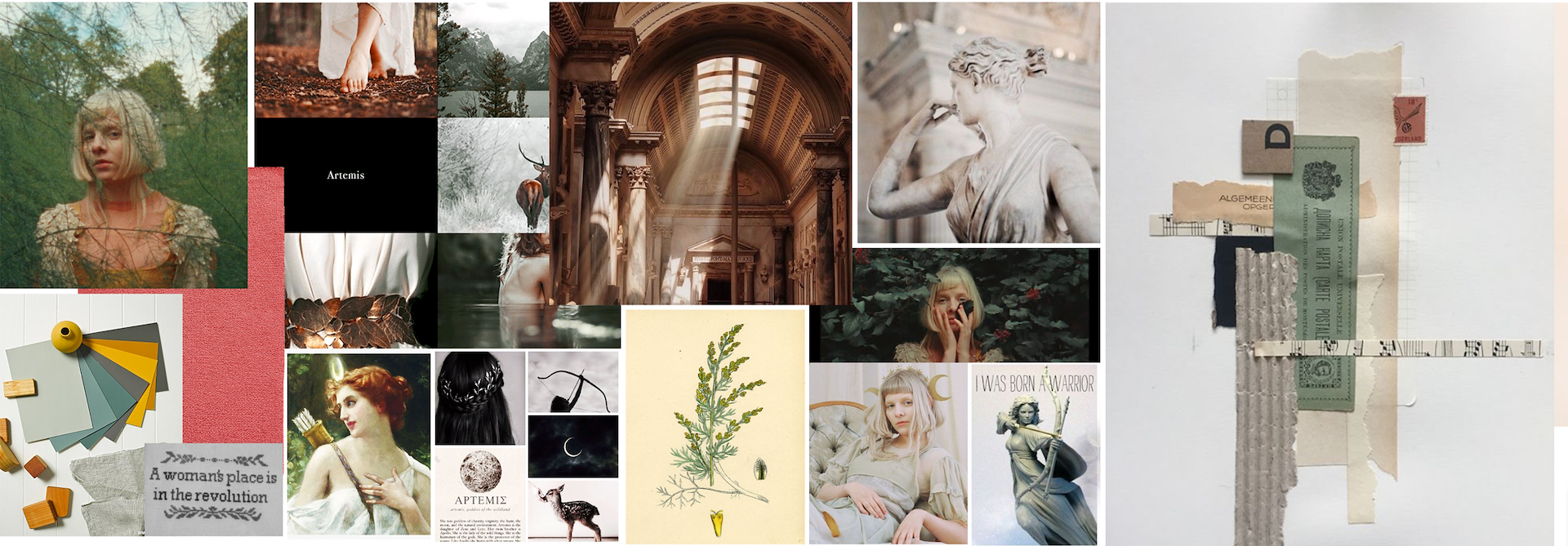
My creative process starts by immersing myself in the beauty of nature and the captivating Aurora. Inspired by these elements, I create a moodboard to set the tone and the foundation for the next step.
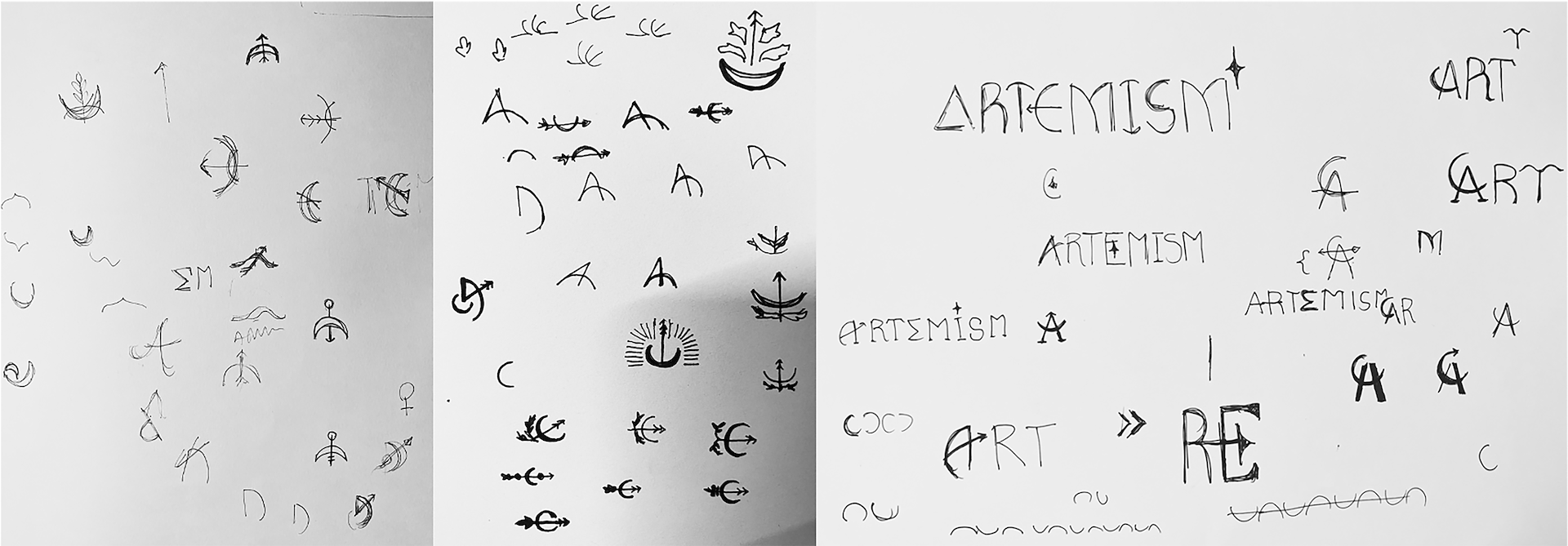
Next, I sketch the logo, incorporating the symbolism of Artemis' bow and arrow. It represents strength, precision, and our connection to the natural world. I spend time refining the sketches until they perfectly capture the essence of Artemism's personality.
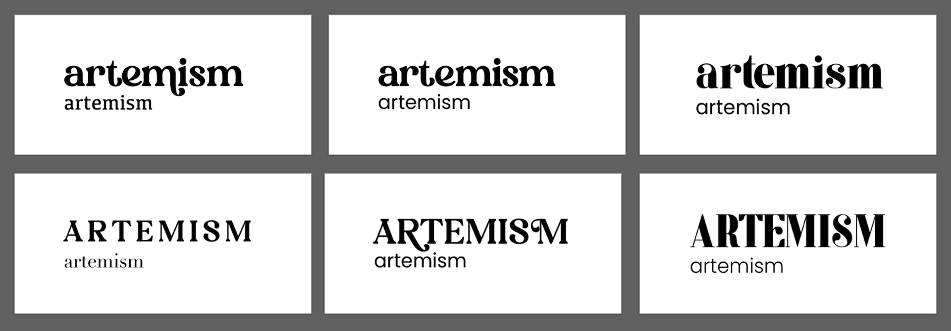
With careful consideration, I experiment with different font combinations, seeking a harmonious balance that complement the logo and convey the desired mood and personality. A serif font to exude a sense of tradition and sophistication, while a modern sans-serif font to evoke a contemporary and clean aesthetic.
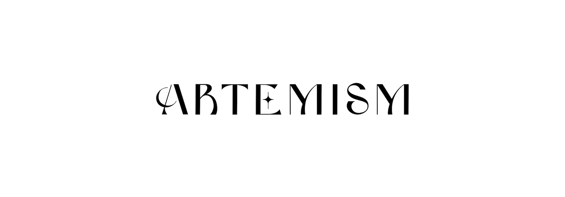
In the final stages of fine-tuning, I bring the logo to its ultimate form by customizing and drawing an icon that seamlessly integrates with the wordmark. This ensures that the logo truly represents Artemism's unique identity, creating a cohesive and captivating visual representation that leaves a lasting impression.
Once the logo is finalized, I proceed to apply it to various brand applications. I also carefully craft the design packaging that aligns with the brand’s visual appeal. To maintain consistency, I develop a brand guideline that outlines logo usage, colors, typography, and other visual elements. This ensures a cohesive brand identity across all future materials and communications.


Brand Book
Flip through the pages for the brand story and detailed visual application
/background(fff)/1920x1370.jpeg?auto=webp)
/background(fff)/1920x1370.jpeg?auto=webp)
/background(fff)/1920x1370.jpeg?auto=webp)
/background(fff)/1920x1370.jpeg?auto=webp)
/background(fff)/1920x1370.jpeg?auto=webp)
/background(fff)/1920x1370.jpeg?auto=webp)
/background(fff)/1920x1370.jpeg?auto=webp)
/background(fff)/1920x1370.jpeg?auto=webp)
/background(fff)/1920x1370.jpeg?auto=webp)
/background(fff)/1920x1370.jpeg?auto=webp)
/background(fff)/1920x1370.jpeg?auto=webp)
/background(fff)/1920x1370.jpeg?auto=webp)
/background(fff)/1920x1370.jpeg?auto=webp)
/background(fff)/1920x1370.jpeg?auto=webp)
/background(fff)/1920x1370.jpeg?auto=webp)
/background(fff)/1920x1370.jpeg?auto=webp)
/background(fff)/1920x1370.jpeg?auto=webp)
/background(fff)/1920x1370.jpeg?auto=webp)
/background(fff)/1920x1370.jpeg?auto=webp)
/background(fff)/1920x1370.jpeg?auto=webp)
/background(fff)/1920x1370.jpeg?auto=webp)
/background(fff)/1920x1370.jpeg?auto=webp)
/background(fff)/1920x1370.jpeg?auto=webp)
/background(fff)/1920x1370.jpeg?auto=webp)
/background(fff)/1920x1370.jpeg?auto=webp)
/background(fff)/1920x1370.jpeg?auto=webp)
/background(fff)/1920x1370.jpeg?auto=webp)
/background(fff)/1920x1370.jpeg?auto=webp)
/background(fff)/1920x1370.jpeg?auto=webp)
/background(fff)/1920x1370.jpeg?auto=webp)
/background(fff)/1920x1370.jpeg?auto=webp)
/background(fff)/1920x1370.jpeg?auto=webp)
/background(fff)/1920x1370.jpeg?auto=webp)
/background(fff)/1920x1370.jpeg?auto=webp)
/background(fff)/1920x1370.jpeg?auto=webp)
/background(fff)/1920x1370.jpeg?auto=webp)
/background(fff)/1920x1370.jpeg?auto=webp)
/background(fff)/1920x1370.jpeg?auto=webp)
/background(fff)/1920x1370.jpeg?auto=webp)
/background(fff)/1920x1370.jpeg?auto=webp)
/background(fff)/1920x1370.jpeg?auto=webp)
/background(fff)/1920x1370.jpeg?auto=webp)
/background(fff)/1920x1370.jpeg?auto=webp)
/background(fff)/1920x1370.jpeg?auto=webp)
/background(fff)/1920x1370.jpeg?auto=webp)
/background(fff)/1920x1370.jpeg?auto=webp)
/background(fff)/1920x1370.jpeg?auto=webp)
/background(fff)/1920x1370.jpeg?auto=webp)
/background(fff)/1920x1370.jpeg?auto=webp)
/background(fff)/1920x1370.jpeg?auto=webp)
/background(fff)/1920x1370.jpeg?auto=webp)
/background(fff)/1920x1370.jpeg?auto=webp)
/background(fff)/1920x1370.jpeg?auto=webp)
/background(fff)/1920x1370.jpeg?auto=webp)
/background(fff)/1920x1370.jpeg?auto=webp)
/background(fff)/1920x1370.jpeg?auto=webp)
/background(fff)/1920x1370.jpeg?auto=webp)
/background(fff)/1920x1370.jpeg?auto=webp)
/background(fff)/1920x1370.jpeg?auto=webp)
/background(fff)/1920x1370.jpeg?auto=webp)
/background(fff)/1920x1370.jpeg?auto=webp)
/background(fff)/1920x1370.jpeg?auto=webp)
Brand Video
Intended Audience: Individuals who value authenticity, ethical practices, and personal freedom.
Insight: In a world that often tries to mold us into something we're not especially by the numerous different beauty brands, there is a growing desire for authenticity and the freedom to embrace our true selves despite the standard.
Big Idea: What if Artemism launch by showcasing diverse women embracing their truest self?
Campaign Line: Activate the Freedom of Being You